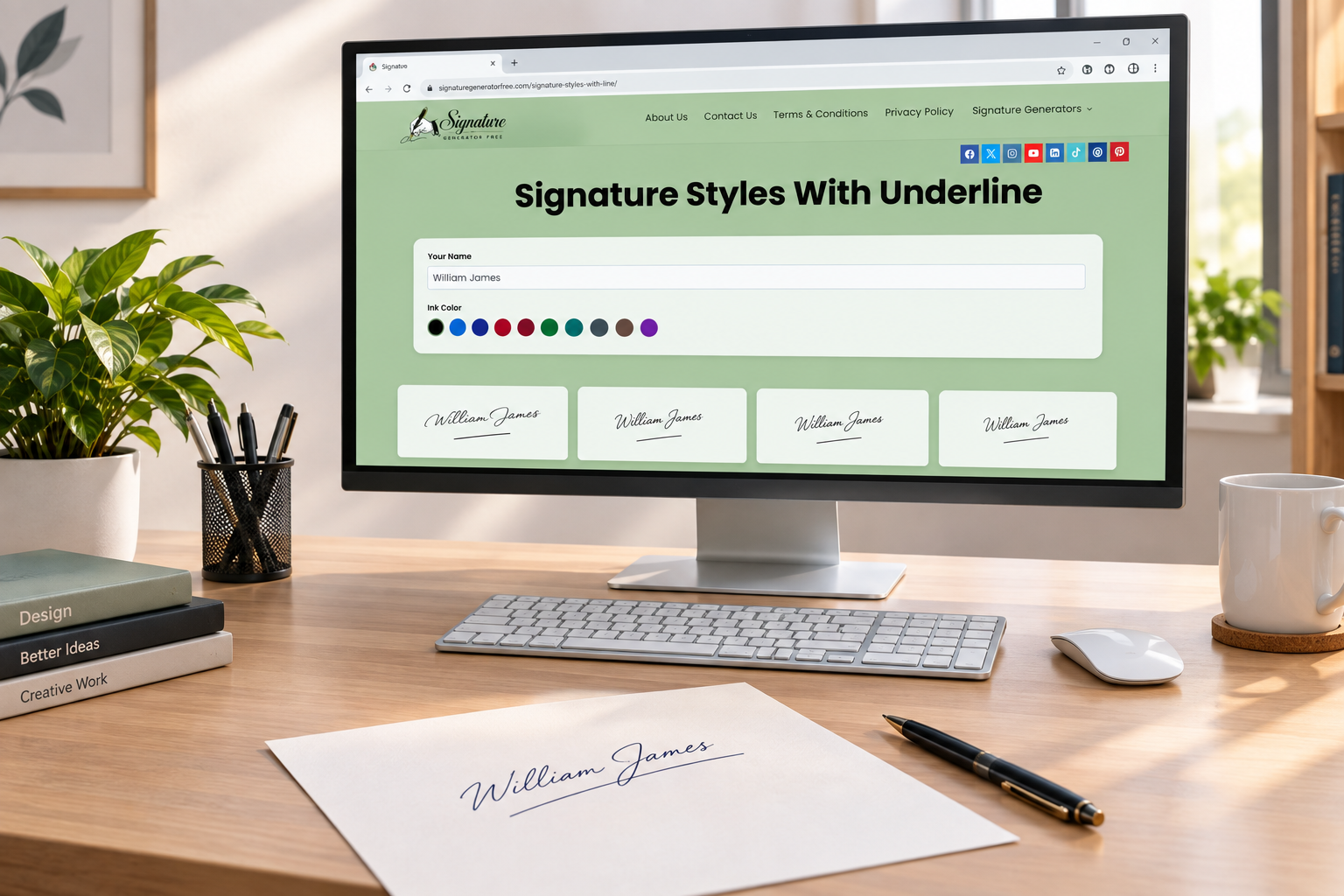
Signature Styles With Underline
Signature Styles With a Line – Underline, Strikethrough & More
- What Are Signature Styles With a Line?
- Why People Add a Line to Their Signature
- Types of Lines Used in Signature Styles
- Underline Signature Styles
- Strikethrough and Cross-Line Signature Styles
- Signature Styles With a Line Below the Name
- How to Create a Signature Style With a Line
- Best Fonts for Signature Styles With a Line
- What a Line in Your Signature Says About You
- Signature Styles With a Line for Professional Use
- Common Mistakes When Adding a Line
- Tips for Choosing the Right Line Style
- Conclusion
- Frequently Asked Questions
Most people never think about their signature as a design choice, until they notice someone else’s has a line running under it or through it and start wondering why theirs doesn’t. Signature styles with a line have been around for decades, turning up on everything from old bank checks to movie contracts, and they’re still one of the more distinctive ways someone can choose to sign their name. This article looks at where that habit comes from, what a line actually adds, and how to pick one that fits you rather than one that just looks nice on paper.
What Are Signature Styles With a Line?
Strip away the terminology and it’s a fairly simple idea. Somewhere in the signature, a line has been added, under the name, through part of it, or trailing off after the last letter, and that’s really the whole category rather than one fixed style. Plenty of people go with a plain underline. Others let the pen keep moving into a long, loose flourish. A smaller group draws the line straight through their own name, which looks more dramatic than it usually is. Whatever form it takes, the line tends to do the same job: mark the end, the way a period closes a sentence. Ask most people why they do it, though, and the honest answer is usually habit. They watched a parent or teacher sign this way once, copied it, and never really thought about it again.
Why People Add a Line to Their Signature
Ask someone why there’s a line under their name and you’ll usually get one of two answers. Either they think it looks more finished, or they picked it up from somebody else years ago and never stopped to question it. There’s a more practical reason too: a blank stretch of space right under a signature can look like an invitation to write something else there, and on forms with a lot of room to sign, that’s a genuine concern for some people. A line also does something for speed. Sign your name fast and messy and it can look careless. Add a line underneath, and somehow the same scrawl reads as intentional instead.
Types of Lines Used in Signature Styles
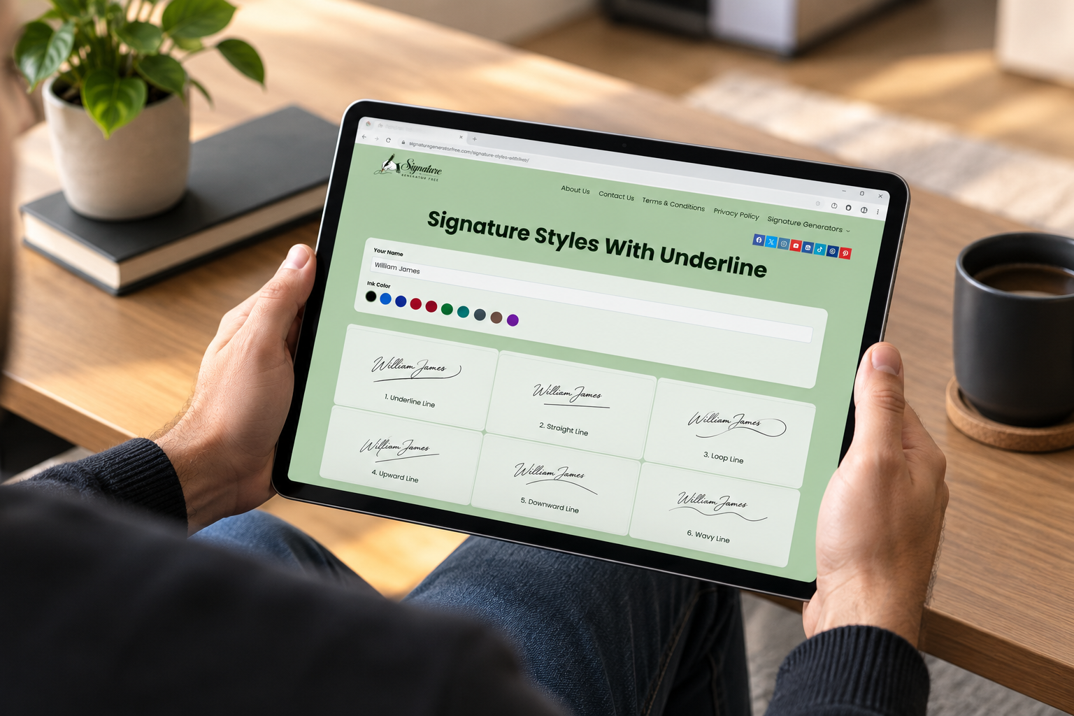
Not every line does the same job. A straight underline just sits below the name without touching it, which makes it simple to draw the same way every time. A curved version keeps that idea but adds movement, often growing straight out of the last letter’s stroke instead of starting over. Some people prefer a horizontal line cutting right through the middle of the name, which tends to show up more in signatures that already lean bold or theatrical. And a handful skip the line altogether in favor of a short flick at the end. Not technically a line at all, but it does the same job of showing where the signature stops.
Underline Signature Styles
This is the version most people end up with, mostly because it’s the easiest to repeat without thinking. Write the name, draw a line under it, done. The one thing that actually matters is proportion. A line noticeably longer or shorter than the name above it tends to look accidental rather than intentional. Some people keep it dead straight. Others let it dip a little in the middle or curl upward at the end, which gives it a slightly more relaxed feel. Either way, it holds up fine for daily use, whether that’s a delivery slip or the bottom of a letter.
Strikethrough and Cross-Line Signature Styles
A strikethrough, where the line runs across the name instead of underneath it, reads completely differently from an underline. It’s bolder, occasionally a little aggressive-looking, and tends to show up on signatures that were already large and fast to begin with. It’s also less forgiving. Get the angle slightly wrong and instead of adding character, it just makes the name harder to read. This style suits someone who already signs quickly and isn’t chasing a tidy, formal look. Some people are simply after cool signatures that stand out from the usual scrawl, and a strikethrough does that better than almost anything else on this list.
Signature Styles With a Line Below the Name
Putting the line clearly below the name, with a bit of breathing room in between, tends to look the most formal of the bunch. The signature itself stays untouched and easy to read, while the line underneath adds structure without ever crossing the letters. It also scans and photocopies better, since nothing overlaps the actual ink. If your signature ends up in scanned paperwork often, that’s a small detail that ends up mattering more than you’d expect.
How to Create a Signature Style With a Line
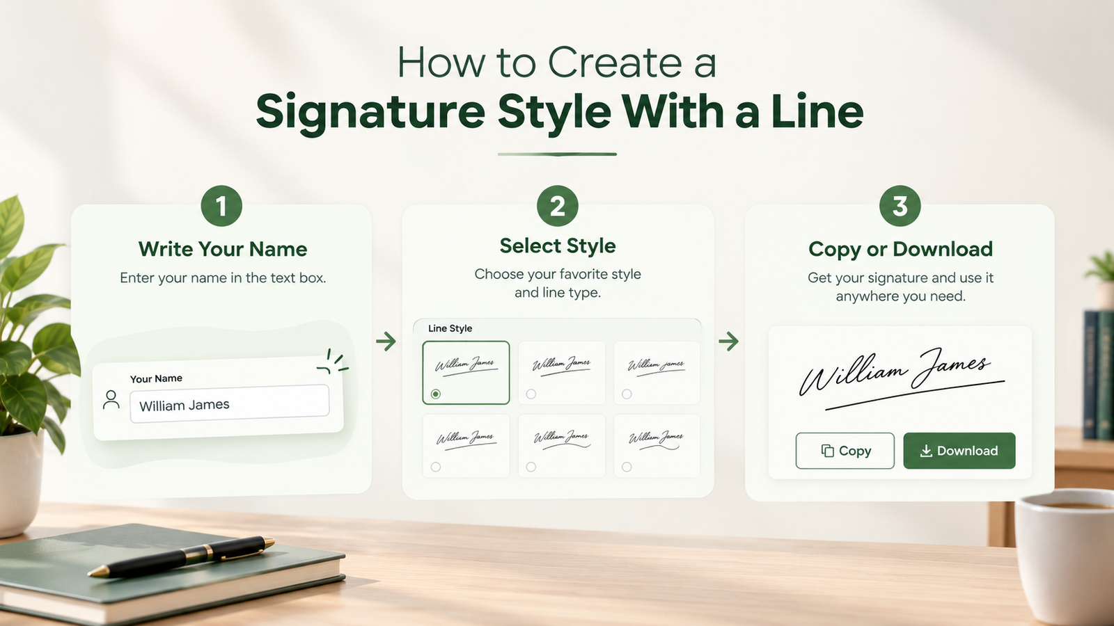
Start by writing your name the way you already do, without thinking about the line yet. Once that feels comfortable, add the line separately, under, through, or trailing off the end, instead of trying to force it into the same motion as the letters. Do it a dozen times or so on scrap paper. What you’re after is a signature line you can repeat without having to think about it, not one that just happened to look right the first time. If you’d rather try a few versions on screen before committing to paper, a tool like our own signature generator lets you preview different line styles and save the final result as a signature image once you’ve picked one.
Best Fonts for Signature Styles With a Line
If you’re building this digitally instead of by hand, the font matters more than people expect. A script with a steady, even baseline pairs more naturally with a straight underline than one where every letter bounces up and down. Wider, bolder scripts tend to survive a strikethrough better too, since the line doesn’t swallow up thin letterforms the way it can with a delicate cursive. The easiest way to tell what actually works is just trying your own name across a handful of fonts, with the line on and off, and comparing them side by side.
What a Line in Your Signature Says About You
Handwriting analysts have opinions about all of this, for what it’s worth. An underline gets read as confidence more often than not, someone comfortable enough with their own name to add a flourish underneath it. A line straight through the signature sometimes gets read as impatience, though plenty of people do it purely because it’s fast, with no deeper meaning behind it at all. None of this is backed by hard science, so take it with a grain of salt. Still, if the signature is going anywhere professional, it’s worth knowing how it might be read by someone who does put stock in that kind of thing.
Signature Styles With a Line for Professional Use
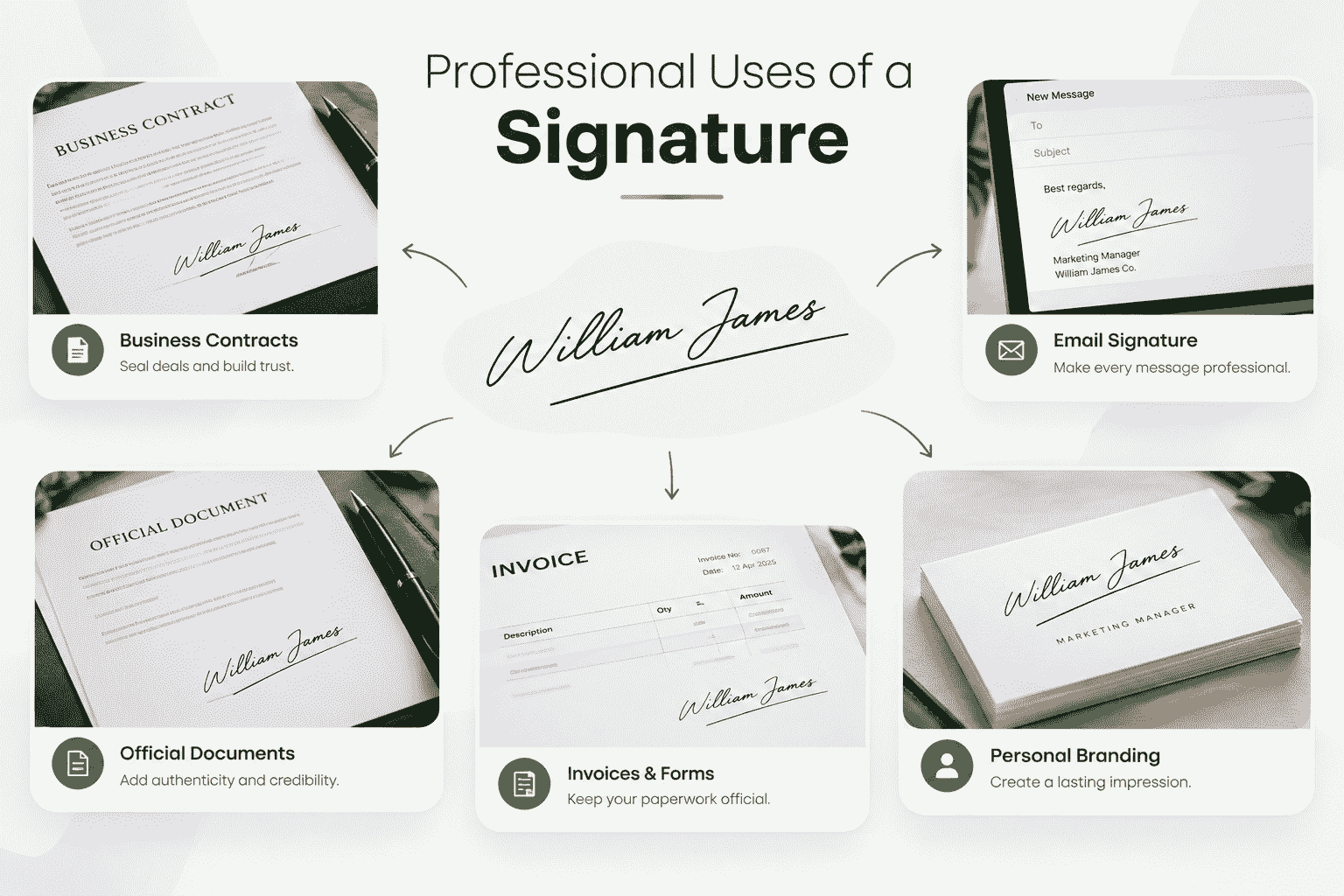
For contracts, official paperwork, or anything client-facing, a clean underline is usually the safer call over a bold strikethrough. It looks tidy and deliberate without pulling attention away from the name, which is the only real job a professional signature has. If you’re signing things often in front of clients, it’s worth picking a line you can draw fast and consistently under a bit of pressure, not something so elaborate it only looks right when you’ve got time to be careful.
Common Mistakes When Adding a Line
A few habits show up often enough to be worth flagging:
- A line that ends up wider or narrower than the name above it, so the two don’t quite match.
- So much flourish added that it’s genuinely hard to tell where the signature stops.
- A strikethrough used on a name that was already hard to read, which just makes it worse.
- A line that changes shape every time you sign, instead of settling into something consistent.
Tips for Choosing the Right Line Style
Sign your name a handful of different ways, underlined, struck through, with just a trailing flick, and compare them side by side instead of judging each one on its own. Looking through a few signature ideas beforehand can save time too, rather than guessing your way there. Pay attention to speed as much as looks, since the version you’ll actually use needs to be something you can repeat without thinking. If you sign a lot of official paperwork, lean toward whichever option stays legible. And there’s no rule saying you’re stuck with whatever you came up with as a teenager. Plenty of people update their signature style once they’ve actually thought it through instead of defaulting to habit.
Conclusion
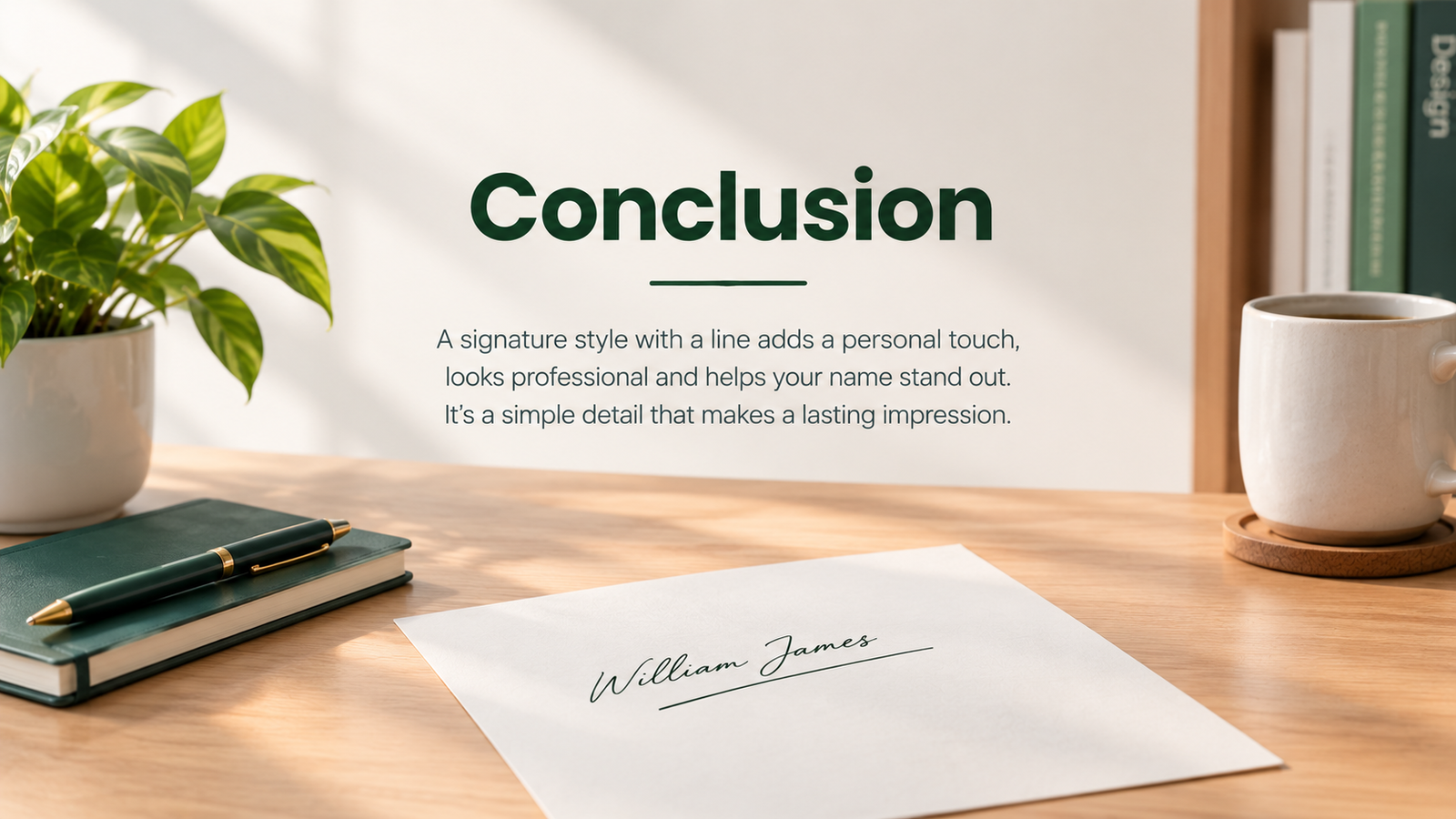
It sounds like a small thing, but a line signature changes how a name reads more than most people expect, the difference between something that looks rushed and something that looks considered, even if that was never the intention. Anyone curious about the psychology angle can dig into the Britannica entry on graphology, which covers the research in more depth, though it’s worth reading as interesting rather than conclusive. For most people, the simplest approach wins out: find a line you can repeat without effort, practice it until it’s automatic, and let it just become part of how your name looks from here on.